Solve Therapy - Logo and Website Design

✓ Logo Design
✓ Website Design
✓ Booking & Payment System
✓ Blog
✓ Accessible Website
✓ Mobile Responsive
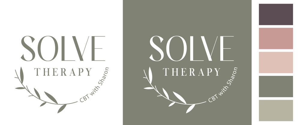
LOGO & BRAND DESIGN
Sharon needed a logo that reflected her values of trust, growth, and compassion. She wanted something soft, nurturing, and professional.
We chose Sage Green as the primary brand colour, paired with plant imagery to symbolise growth and renewal. Rounded edges and gentle visual cues helped reinforce a sense of safety and care.
Logo design featuring organic, nature-inspired elements.
Colour palette built around calming greens and neutrals.
Typography selected for clarity and warmth.
Sharon now has a logo and visual identity that align perfectly with her counselling practice, giving her a cohesive, professional look across her website and marketing.
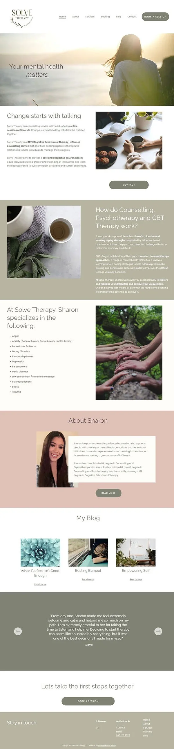
WEBSITE DESIGN
Sharon wanted a website that felt warm, professional, and inviting for clients seeking counselling. It needed to:
Include booking and payment functionality for easy scheduling.
Offer a blog to share her personality and help new clients understand what to expect.
Provide a sense of comfort and security through design choices.
I focused on creating a site that feels soothing and easy to navigate. Using calming visuals, clean layouts, and clear calls to action, I ensured that visitors could quickly find what they needed, whether that was booking a session, reading the blog, or learning more about Sharon’s services.
Solution:
Squarespace website with integrated booking and payments.
Blog, About, and Contact sections with thoughtful structure.
Mobile-friendly and accessible design for all visitors.
The new site now reflects Sharon’s professionalism while maintaining a calm and approachable feel. The booking system streamlines the connection between clients and her, and the blog provides reassurance before a first session.